

I am going to guess you might be having a hard time choosing the right color palette for your home and thats why you are reading this? I am sad to say that most people do not find picking colors for their homes or decor as enjoyable as I do. And thank goodness because I would be out of a job. I truly believe that color should be your first focus when designing your space and thats why I wrote this blog.
“So many people focus on style, when you should be focusing on Color!”
Your color palette will influences the mood, ambiance, and even the perception of space within your home. Whether you are refreshing a single room or embarking on a whole-house makeover, selecting the perfect color palette is a big decision that requires thought. There is a lot more to picking colors than “its my favorite”. Your color palette should be personal and made up of colors you enjoy but for most people it can be hard with so many options. That can make the whole design process frustrating. I do find the main reason people need a little help is because they do not know where to start.
So let’s start off by talking about what a color palette is. A color palette also known as a color scheme is just a combination of colors that complement each other, blend well and are visually pleasing. That should be easy right? It is until you realize that blue is just not blue and there are 100s of shaded of white. So let me give you a few rules you can follow when picking your color palette.
Understanding Color Theory
Before diving into the vast sea of colors, let’s go back to elementary school. Who remembers the color wheel? The color wheel, a fundamental tool in color theory, illustrates the relationships between colors. It’s divided into three primary colors (red, yellow, and blue), three secondary colors (green, orange, and purple), and six tertiary colors (mixes of primary and secondary colors). Colors can be combined in various ways to create different moods and styles. For example, analogous color schemes use colors that are next to each other on the color wheel, creating a serene and comfortable design. In contrast, complementary color schemes, which pair colors opposite each other on the wheel, introduce a vibrant and dynamic ambiance.
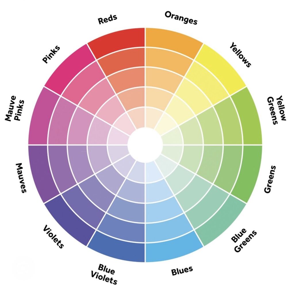
Sorry that was a lot of technical color information and that is why added a color chart for you to look at . This information is helpful and I still use these principles today when designing color palettes.
Consider the Psychological Effects of Color
I know it seems like I am getting way to deep when we are just picking colors however, I promise these are helpful. Colors have the power to evoke emotions and influence the mood of a room. Warm colors like red, orange, and yellow can create a cozy and inviting atmosphere, yet they can also stimulate the senses and increase energy levels. Cool colors such as blue, green, and purple, on the other hand, have a calming effect and are ideal for creating a tranquil retreat. Neutral colors, including white, beige, gray, and black, offer versatility and can serve as a foundation for any color scheme, allowing for flexibility in decor changes over time.
When choosing a color palette for your home, consider the function of each room and the atmosphere you wish to create. For example, a bedroom may benefit from soothing cool tones for a restful environment, while a kitchen or dining area may thrive with the warmth and vibrancy of red or yellow. I will point out these are guidelines personally my dinning room is a deep navy color and I love it.
Practical Considerations
While aesthetics are important, practical considerations should not be overlooked. Light plays a significant role in how colors appear in a room. Rooms with plenty of natural light can handle darker or more saturated colors, while spaces with limited light may benefit from lighter hues to make them feel airier.
Remember you have to work with existing features in the home. The color of you flooring, cabinets, countertops and furniture are all things that you have to consider if you are not doing a total renovation. These can limit the colors you need to work with.
Also, consider the flow of your home. Open-concept spaces may require a more unified color scheme to ensure a seamless transition from one area to another, while separate rooms can afford more individuality in color choices.

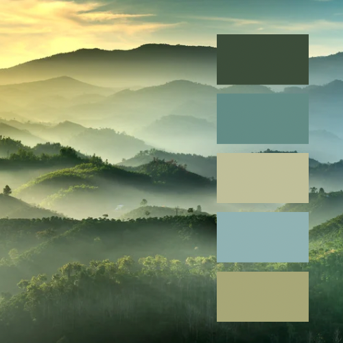
(I used this photo of our son at sunset as inspiration for our main color palette)
Drawing Inspiration and Setting a Theme
Now to the fun part! Inspiration for your home’s color palette can come from anywhere. Nature, art, fashion, travel, and even your personal experiences can spark ideas. Begin by collecting images, fabric swatches, and objects that resonate with you. Look for a common thread among these items, such as a recurring color or mood, to help define your theme. This theme will serve as a guide as you select colors, ensuring a cohesive look throughout your home.
Setting a theme also involves considering the architectural style and period of your home. Even consider the location you live in. A historic Victorian home, for example, may lend itself to rich, deep colors and intricate patterns, while a modern minimalist home might call for a more subdued, neutral palette.
Creating Your Color Palette
Once you have thought about all the a basic understanding of color theory, an awareness of the psychological effects of colors, and a theme in mind, you’re ready to create your color palette. Start with one main color. This color that will serve as the dominant hue in your space. This could be a bold color for walls or a neutral tone that acts as a backdrop for your furnishings and decor.
Next, choose secondary colors to support and complement your main color. These can be used for accent walls, furniture, or accessories. Finally, select accent colors to bring depth and interest to the palette. These can appear in artwork, throw pillows, rugs, and other decorative elements.
I suggest you always have at least three colors in your palette but I prefer more. When I design color palettes I tend to choose 5 to 9 colors. It sounds like a lot and overwhelming but you might not even use all the colors but it gives you options that you know will blend well when hunting for that perfect art work, pillow or fabric.
Choosing the right color palette for your home is a deeply personal and creative process that can transform your living spaces. By understanding color theory, considering the psychological effects of colors, drawing inspiration, and making informed choices, you can create a beautiful color palette for your home that reflects your unique style and meets your needs. Remember, the best color palette is one that brings you joy and comfort, not the one that is trendy or in style. Color is what helps makes your home a true reflection of you.

For more ideas and inspiration from M4 Designs, check out these recent posts:
- Revamp Your Living Space Affordably
- 5 Rules when Staging Decor
- Find Your Homes Style
- Color Palettes for Your Home